Opened 8 years ago
Closed 8 years ago
#5145 closed defect (fixed)
Variables browser does not make difference between parameters and variables
| Reported by: | massimo ceraolo | Owned by: | Adeel Asghar |
|---|---|---|---|
| Priority: | high | Milestone: | 1.13.0 |
| Component: | OMEdit | Version: | v1.13.0-dev-nightly |
| Keywords: | Cc: | Francesco Casella, Rüdiger Franke |
Description (last modified by )
In variables Browser state variables and parameters have a box that allow selecting a value. In the first case it is an initial value, in the latter it is the value to be held constant during simulation.
When the user runs a complex model (especially if he has not developed it himself) he might not be immediately aware whether a variable is a parameter or a state variable. I would recommend to distinguish the two cases graphically.
Moreover there is no need to plot parameters.
So, to make visual difference between parameters and state variables, the best solution seems to be to make parameter non-selectable for plotting, i.e. without check box or with check-box disabled.
I hope this is possible with a limited effort.
As an alternative, if plotting parameters is deemed a useful feature, we could make a different visual difference, e.g. the box for initial values of state variables could have a greyed background;
Attachments (7)
Change History (25)
comment:1 by , 8 years ago
| Description: | modified (diff) |
|---|
comment:2 by , 8 years ago
| Description: | modified (diff) |
|---|
comment:3 by , 8 years ago
| Summary: | Variables browser does make difference between parameters and variables → Variables browser does not make difference between parameters and variables |
|---|
comment:4 by , 8 years ago
| Cc: | added |
|---|---|
| Status: | new → accepted |
follow-up: 6 comment:5 by , 8 years ago
Replying to ceraolo:
In variables Browser state variables and parameters have a box that allow selecting a value. In the first case it is an initial value, in the latter it is the value to be held constant during simulation.
When the user runs a complex model (especially if he has not developed it himself) he might not be immediately aware whether a variable is a parameter or a state variable. I would recommend to distinguish the two cases graphically.
One option is to put a 'p' or 's' immediately to the left of the value box, and when you hover on it with the mouse you read "Parameter value" or "Initial state value"
Moreover there is no need to plot parameters.
I disagree with that in general. For example, you may have a nominal value of a certain quantity as a parameter and you may want to plot that together with the actual variable, to see how much it strays away over time. I see no reason why this shouldn't be allowed.
comment:6 by , 8 years ago
One option is to put a 'p' or 's' immediately to the left of the value box, and when you hover on it with the mouse you read "Parameter value" or "Initial state value"
If the box is shaded we do not waste any pixel of the precious horizontal space of the Variables Browser, so I would prefer this to adding 'p' or 's'.
I disagree with that in general. For example, you may have a nominal value of a certain quantity as a parameter and you may want to plot that together with the actual variable, to see how much it strays away over time. I see no reason why this shouldn't be allowed.
OK. I himself added this in the bottom part of the ticket's description.
follow-up: 8 comment:7 by , 8 years ago
Unfortunately Francesco's idea will not work since we can either have an editbox or a text.
The shading proposal is possible. Just to make sure you want greyed background for states or parameters?
Note that greyed background usually mean disabled textbox.
comment:8 by , 8 years ago
Replying to adeas31:
The shading proposal is possible. Just to make sure you want greyed background for states or parameters?
Note that greyed background usually mean disabled textbox.
That's what I was thinking, that a greyed background could be misleading. How about an embossed textbox, or a textbox with thicker border?
by , 8 years ago
| Attachment: | GrayBg.png added |
|---|
by , 8 years ago
| Attachment: | ThickBorder.png added |
|---|
comment:10 by , 8 years ago
I confirm I don't really like the gray background - that really looks too much like a disabled textbox, which is not.
Another option could be to use italics font for either parameter values or initial states. That would show some difference, without catching the eye too much.
@ceraolo, what do you think?
comment:11 by , 8 years ago
Yeah greyed usually means disabled.
After having seen the boxes indeed their visibility is a bit excessive. Adeel can you show us the italics option?
I agree with Francesco that a mimimal differentiation is the best solution.
comment:12 by , 8 years ago
I would suggest also to test the option of using grey font for parameter names (not values), under the idea that they are weaker candidates for plotting than quantities with higher variability.
Having a screen also of this choice would help a shared and nice decision.
by , 8 years ago
| Attachment: | ItalicParameters.png added |
|---|
by , 8 years ago
| Attachment: | GrayParameter.png added |
|---|
by , 8 years ago
| Attachment: | DarkGrayParameter.png added |
|---|
by , 8 years ago
| Attachment: | DarkGrayItalicParameter.png added |
|---|
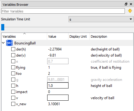
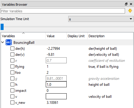
comment:13 by , 8 years ago
I suppose when we talk about making it italic or changing the font color then we want it for the whole row.
There are four more alternatives,
- Italic font.
- Gray color font.
- Dark gray color font.
- Dark gray color italic font.
by , 8 years ago
| Attachment: | GrayBoldParameter.png added |
|---|
comment:14 by , 8 years ago
good landscape!
The two I most prefer are DarkGrayItalicParameters and ItalicParameters.
Francesco, in case you feel comfortable with one of these, please propose the winner.
comment:15 by , 8 years ago
I'm sorry to waste your time on a subject that is probably a bit of bike shedding, but I don't really get why parameter values (or their description) should be greyed at all. Parameter values are not second class simulation results, compared to variable values, so I don't see any reason to try to make them "less relevant" by making them gray.
BTW, in many cases, simulations go wrong because for some reason (e.g. wrong parameter propagation, or convergence issues with fixed = false parameters) the actual computed values of some parameters are different from what the end user would expect - this happened to me many times. The only way to figure this out is to actually check the computed values in the simulation results. Why should we try to somewhat hide them or make them less visible or seemingly less important? I personally find this outright confusing.
If there is a use case to select only variables (or, possibly, only time-varying variables) for display, we should include a filter in the result window for this purpose. Personally, I don't see a need for that, but it maybe useful in some cases.
Anyway, I understand the goal of this ticket was to differentiate between textboxes to input parameter values, and textboxes to input initial states, which I think is a good idea.
My proposal for this purpose is to make one of the two types of textbox use italics font, so it is clear that there is a difference between parameter values and initial state values. I have no strong opion on which one, though I'd slightly prefer to use italics for initial states. No bold, no grey. Anything more than that seems to me visually too intrusive, without a real reason for being so. In particular, I don't see a reason to change the font of name, unit, and description.
My two cents :)
follow-up: 17 comment:16 by , 8 years ago
Well, @casella, I myself asked you to make the final decision.
In case you wrote your latest very detailed message to convince me you spoiled your time: I was already convinced.
comment:17 by , 8 years ago
Replying to ceraolo:
Well, @casella, I myself asked you to make the final decision.
In case you wrote your latest very detailed message to convince me you spoiled your time: I was already convinced.
Bike shedding is an all-too-powerful temptation :)
comment:18 by , 8 years ago
| Resolution: | → fixed |
|---|---|
| Status: | accepted → closed |
Parameter textbox use italic font now. a83744b/OMEdit.
From my side both solutions are implementable with minimum effort. The only open question is what is more beneficial for the modelers. I added Francesco and Rudiger in the CC list to get an idea what they think about it?