Opened 9 years ago
#4437 new enhancement
Quality of OMEdit plots not totally satisfying
| Reported by: | massimo ceraolo | Owned by: | Adeel Asghar |
|---|---|---|---|
| Priority: | normal | Milestone: | Future |
| Component: | OMEdit | Version: | |
| Keywords: | Cc: |
Description
I think that the quality of OMEdit’s line plots is not totally satisfying.
We have several details that are sub-optimal and reduce the user experience’s quality. AFAIK the majority of them depends, directly or indirectly, on the plotting tool used, Qwt. I mean directly when a feature is actually not available in Qwt, indirectly when a feature is not directly supported but could be obtained through workarounds.
Recently in the Qt world QChart has appeared, which is built-in in the Qt libraries. I did not try it yet, but I think it would be useful to have a look at it to see whether its quality is better or worse than Qwt’s, for OMEdit purposes.
For the developers’ convenience, I try to list here the glitches that, IMO we should try to improve.
1) Zooming. Very often the user might want to zoom a borderline zone of a plot. For instance the left part, or the right, or the upper or the lower. Consider the case one wants to zoom the left part. The most natural way is start to draw the zooming rectangle left of the left border of the plot to indicate that that left part of the plot is to be included. This is currently impossible in OMEdit. AFAIK there are not specific tickets on this
2) Number and size of numerical labels on axes. When we make tiny plots (that are very useful and common for large simulations and tiled plots) the axes are too crowded, with even overlapping numbers.
3) Font size. Both Dymola and OMEdit do not change the font size of the numerical labels on axes with plot’s size. Indeed for very tiny plots some reduction would be advisable. For me a small reduction (not a proportional reduction!) of font sizes for small plots is advisable. I see that OMEdit used a bit larger fonts than Dymola. Maybe they can be left as they are, in case of plots having both dimensions at least 400 pixels and reduced by 1-2 points for smaller plots (maybe 1 point for mildly small, 2 points for very small ones)
4) Minor gridlines Minor gridline were “invented” to find correct values when plots were on paper. On PC’s screens, basically they are useless since we can peek the actual values directly with mouse hovering. Being useless, they are more or less some “background noise” shat should be avoided; at least they should be disabled by default. (IMO they could be even dropped, but this is a question of taste)
5) Legend. It occupies too much space. The space above and below legend names it is too large; in addition, the usage of coloured text would save even more space.
6) Minimum plot size. When large simulations are analysed it could be useful to tile several plots, to have a global vision of the results. However, OM does not accept plots below a certain size, which is an unnecessary limitation, if the plot engine is good enough to understand that with smaller plots it has to reduce the number of numerical labels on the axes accordingly.
Evaluation of some of the previous points based on examples.
I will now discuss two examples in which I compare OM plots (1.12 .alpha1) with other display tools.
A) Comments TwinSmallPlots.png.
This file shows twin Dymola and OMEdit windows displaying the same plot. I can comment as follows:
- Plot size: the plot height I want is Dymola’s, but this is impossible to reach with OMEdit which has a larger minimum size
- Numerical labels: OM’s plot has too many of them on both axes and on the horizontal axis even overlap
- Legend space occupation: OM’s is too much and steals space to plot area
- Minor tick marks: for tiny plots they are useless and should be removed in OM. In Dymola they are not shown.
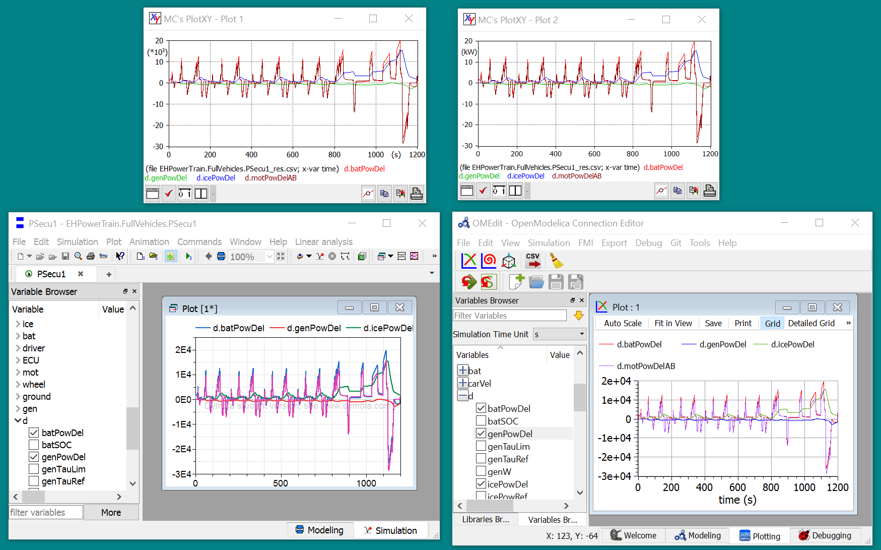
B) Comments ThreeSeveralPlots.png.
This file shows three windows displaying the same plot. Above there are plots made using the freeware PlotXY, below the same plots made with Dymola and OMEdit.
I can comment as follows:
- Legend space occupation. Here, IMO, both Dymola and OM are bad: Dymola does not show some of the variables, OM uses too large vertical space for legend text. PlotXY exploits all the available space. In particular:
- In comparison with OM’s PlotXY shows that the legend can occupy vertically much less space, and contain more information (also the file name)
- In comparison with Dymola’s PlotXY shows that the legend can occupy roughly the same space and give also the file name. In case the file name is dropped, with less space than Dymola it can show all the variables, with the trick of using coloured text
- Labels on the vertical axis. Here IMO the right solution would be to add once on the axis “*103” and use numerical labels without the exponential part (as per upper-left plot). Both Dymola and OM fail to do that. OM, in addition, is worse since the exponent part uses a 4-character space instead of two. Whenever the unit of measure is available it should be used, with correct usage of standard prefixes (upper-right plot)
Just a final word on this ticket's meaning.
I know that many people think that plotting in OMEdit simply works and therefore discussing these details is a waste of time. This is not my opinion: for me quality counts. That's why I created PlotXY. That's why I used on this ticket title the word "quality". This ticket is not on pure usability, but on quality of details. Steve Jobs changed the world just starting to make the same things others already made, but with higher quality...
Attachments (2)
Change History (2)
by , 9 years ago
| Attachment: | TwinSmallPlots.png added |
|---|
by , 9 years ago
| Attachment: | ThreeSeveralPlots.png added |
|---|